
Web development of auld lang syne
I am really excited to say that the update to Thudfactor that posts this also removes PostCSS from the blog’s build process. SASS and PostCSS handled a lot of CSS complexity. But the CSS standard has mostly caught up to what these tools provide, so now I can now ship exactly the CSS I write… at least for this project.
To celebrate, I wanted to make note of several other strategies that have faded into distant memory.
Presentational HTML
It’s bonkers to think about now, but back when I first started the way you changed font sizes was through a <font> tag. If you needed text (or anything!) to be center-aligned, you used <center>.
<center><font size="5" face="arial" color="red">Hello, World</font></center>
<p></p>
Some pre-css HTML circa 1996. The size attribute offered seven different, imprecise sizes. There was no concept of a </p> closing tag, and convention was to place it at the end of a paragraph.
Redesigning often meant crawling through the code, moving and changing these. It was such a tedious, awful, and error-prone process I learned text-editor keyboard shortcuts and regular expressions to cope.
Replaced by: CSS
/cgi-bin/
Very early on, the way you got web sites to do anything with form data was through the excitingly arcane language Perl. Perl scripts were all shoved into one /cgi-bin/ directory. When web-host shopping, you wanted one that gave you access to that so you could get your email contact form working.
@origarray=('0 1 2','0 0 0','-3 -2 -1','10 11 12');
@sortedarray=
 map{$_->[0]}
    sort{$a->[1] <=> $b->[1]}
       map{
          my @cols=split(/\s+/);
          my $sum=$cols[0]+$cols[1]+$cols[2];
          [$_,$sum];
       } @origarray;


foreach(@sortedarray){
  print "$_\n";
}
Some sample PERL code from 1999, creating and then sorting an array.
Source: PerlMonks
Replaced by: Cold Fusion (memories!), PHP, ASP, Ruby, Node
Javascript Libraries of Yore (MooTools, Prototype, Scriptaculous, jQuery)
The Scriptaculous web site is still around, although the last update seems to have been in August of 2011.
Once Javascript matured a bit and it became possible to manipulate the DOM after the HTML was sent to the browser, lots of libraries popped up to make this process a heck of a lot simpler. The basic Javascript tools were very limited and low-level. Some were focused more on visual effects than others, but eventually everyone bowed to jQuery.
Replaced by: JavaScript ES6 and beyond. jQuery is still very much with us, of course, but many of its concepts got pulled into Javascript proper.
Layout Hell
The web was not originally created with rich design in mind, and the first few passes were made by folks who didn’t understand design all that well to begin with. So we had a lot of different coping strategies.
Our Site is an Image Map
One popular mechanism was to just make one honking great image and turn it into an image map to scatter the links throughout. These made pages very heavyweight at a time when most people connected to the Internet through very slow modem connections, but they were popular with early designers who saw them as a way to regain rich design without having to learn much HTML at all.
Around 1998 I was looking into going back to school for web design and the local university’s “web design” web site was just a whole bunch of these.
Replaced by: Better design capabilities in HTML and CSS in general
Suggested by: @[email protected]
Table-Based Layout
In the earliest days you just couldn’t have a sidebar. Everything was presented in one column. Once <table> made it into browsers, people started using these to lay out pages. There was a huge debate over this at the time. “Tables should be for data!” some people said. “How else are we going to do design?” other people said. The designers won.
I think this was the beginning of the understanding that the web was going to evolve into a designed medium.
But that was still all we had for several years, very fancy designs were produced using increasingly elaborate, sometimes nested, tables. Tools like Macromedia Fireworks and Adobe ImageReady would let designers create huge image-map-like comps and slice them into hundreds of tiny images, which web developers would then turn into something more fluid and suited to the web.
Heavily related is the 1x1 transparent spacer gif, which was a tiny one-pixel image that was resized as needed to hold table cells open when the image inside them was loaded as a background.
Replaced by: Float-based layout
Float Based Layouts
The alternative to tables was using the css float property. It was the only way of pushing things into different column shapes. It was also and far less precise than table layouts. Web standards and accessibility advocates dug in their heels on this, though, leading to lots of arguments with designers frustrated that the effects they could achieve through tables just weren’t available anymore.
It wasn’t really until the advent of responsive design that the rigidity of table-based layout dragged the last holdouts into modernity.
If you’re really curious, here’s a 2011 float-based layout tutorial from CSS-Tricks. Pay close attention to the “clearing the float” section, which was crucial to managing these layouts.
Replaced by: Flex, grid layouts
Suggested by: @[email protected]
Image Background tricks
I reach for this so rarely now, but there was a time when being a front-end web developer meant mastering a whole host of techniques that involved loading an image in the background.
Image Replacement
For many years, web sites were limited to using the limited set of fonts that were commonly installed on people’s computers. Designers introduced their own typefaces — for things like navigation, anyway — by setting type in images and using those instead.
Obviously this is horrible for accessibility, so early accessibility efforts involved using real text inside links, but loading the image-text as a background. Then you would use CSS to hide the text off-screen somewhere and make sure the background container was the right size.
Any text change meant having to produce a new image, however, which made this unsuitable for headlines. A late modification on image replacement was sIFR, which involved a small Flash file with an embedded font that could pull text from elsewhere. It’s hard to describe what a relief this was, but it did proliferate lots of tiny swf files throughout a site.
Flash, and thus sIFR, suffered a quick death when Apple refused to let Flash load on iPhones.
Replaced by: @font-face, which enabled the delivery of web fonts.
Faux Columns
Float-based layout forced much simpler design, but one of the intolerable losses was having a column-based layout where (for example) the left column and the right column backgrounds ended at the same point. “Faux columns” was a technique that ran a large background image behind a wrapper that had all of the column decorations in place; then you would align your float layout over the top. This was indispensable for many years.
Replaced by: Flex, Grid
Table-based layout (for elements!)
Nowadays you can put rounded borders on something with border-radius, but before then, one way you could do this was to do a tiny table-based nine-slice layout.
<!-- old style -->
<a href="http://www.example.com/">
	<table class="red-border-button">
		<tr>
			<td class="red-button-tl"><img src="red-button-green-bg-tl.gif" width="5" height="5" /></td>
			<td class="red-button-t"></td>
			<td class="red-button-tr"><img src="red-button-green-bg-tr" width="5" height="5" /></td>
		</tr>
		<tr>
			<td class="red-button-l"></td>
			<td class="content">Buy now</td>
			<td class="red-button-r"></td>
		</tr>
		<tr>
			<td class="red-button-bl"><img src="red-button-green-bg-bl" width="5" height="5" /></td>
			<td class="red-button-b"></td>
			<td class="red-button-br"><img src="red-button-green-bg-br" width="5" height="5" /></td>
		</tr>
	</table>
</a>
A button with rounded corners, circa 2002. Every dang button that used this style had to have this table wrapped around it. Note the lack of alt text on any of the images.
The four corners would have tiny images in them. The edge pieces would have repeating backgrounds for the border edges, and then the center area could grow as needed.
So. Many. Tables.
Replaced By: “Sliding Doors,” (below)
Suggested by: @[email protected]
Sliding Doors
A related technique to faux-columns was called “sliding doors.” In this, you had a background that consisted of two layers. One would slide under the other to make a background container flexible in one dimension. It was used a lot for navigation and buttons.
It’s hard to visualize, so here’s a 2003 article from the very influential A List Apart explaining the technique.
Replaced by: CSS3
Suggested by: @[email protected]
Sprites
One of the earliest CSS tricks I learned was how to swap images out of the background of a link when you hovered. If you did it the naïve way — changing background-image URLs — there was often a noticeable lag on hover as that image was downloaded. The solution was to put both states in one image, then shift background-position around.
This later expanded into the performance-enhancing (but maintainability-destroying) advent of sprite sheets. Sprite sheets might contain several needed incidental graphics like bullet styles, backgrounds, icons, and the like into one image which could be downloaded with one request and then shifted around with background-position in CSS.
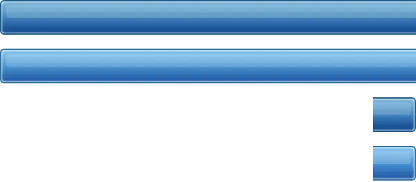
A very small sprite sheet for a sliding doors button. It’s a little hard to tell just looking at the sheet, but this contains both the normal and the hover state for the button design.
Image source: Devin Olsen’s
What is a CSS sprite anyways?
The technique required a great deal of precision and made changes and updates difficult. Especially if you weren’t the original design agency and couldn’t get the source Photoshop files.
Replaced by: SVG, CSS, more efficient browser load behavior in general
Suggested by: @[email protected]
Bloody Hacks
You could argue that most of web development for the first ten years or so was just exploiting various tricks and workarounds. But here are a few.
Matching background colors for transparent GIFs
Until about 2007, if you needed bits of your website to show through an image your only choice was a transparent GIF. The problem was that GIFs only had 1-bit transparency, which means a pixel was either fully transparent or completely opaque. This would cause an ugly, rough halo around images if they were used on a different background color than where they were used.
To get around this, you had to make your transparent GIF in an image editor using a solid background that matched where you were going to … here, just read this Stunning Mesh tutorial from 2009.
Replaced by: PNG, WebP, SVG
Suggested by: @[email protected]
Progressively loading images (with tables!)
Then, as now, if you have a really large image it can take forever to download without much user feedback that anything was happening. One solution was to slice the image up into a lot of smaller bits, then re-assemble them in the browser with a table. This way, bits of the image could load in. Ultimately this made the total file size larger and the download slower, but at least it gave some feedback.
Replaced by: Better compression (webp, for example). Broadband. Paying attention to download sizes. Also picture and img srcset.
Suggested by: @[email protected]
Annoyances
Java Applets
The early web — especially before the widespread adoption of Javascript and the technique called DHTML (for “Dynamic HTML”) — was a very static place. One mechanism for injecting app-like behavior or even just some visual flair was writing a small program in Java and shipping it as a browser applet.
These tended to be hideous and often used for pointless things like animated news tickers, but the worst thing was they would lock up the entire Mac OS until all the applets on a page were downloaded and booted. Mac users in the mid 90s never knew when they hit a new web site if their computer was going to just beach-ball for ninety seconds.
Replaced by: Shockwave, Flash
Flash
Shockwave, and later it’s younger brother Flash, took out Applets. These were both very design-forward tools and they let skilled multimedia designers create elaborate experiences and deliver them over the web instead of CD-ROM.
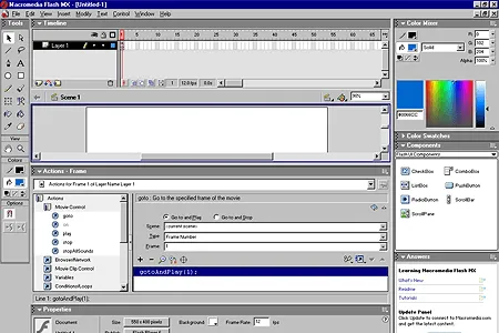
The Flash timeline was a familiar place for motion designers but pretty inscrutable for web developers used to working in text documents.
Image Source:
The Web Design Museum
There was real concern that the entire web would become this, but Flash was hard to write applications in and very hard to code. Frequent security flaws in the Flash player also limited adoption, especially on work machines. After a brief period where some folks, particularly design agencies, experimented with Flash-only web sites, things moved back around to web standards.
Replaced by: HTML5, Javascript ES6
WYSIWYG web development apps
One thing that has never changed is that professional web development happens in a text editor or IDE, although the death of the web developer in favor of design tools has been predicted for many years. Attempts to replace writing actual code started pretty early with Netscape 4, which shipped with Netscape Composer. There was also Microsoft FrontPage, Macromedia Fireworks, Adobe ImageReady, and (of course) Dreamweaver.
It’s been a long, long time since I met any web developer who relied on any of these tools.
Replaced by: CMS themes, as well as site builders like SquareSpace and Wix
I could just keep going! As new techniques replace the old and web development languages get more sophisticated, it’s good to take some time to look back at how far we’ve traveled.
As each new technique replaces the status quo, it’s common to hate on what we’re leaving behind. This was especially true with things like Flash and table layouts. But these tools came about in an attempt to push the web much farther than the current standards could manage, and the standards often caught up.
This is still happening today, as Javascript, HTML, and Javascript begin to provide functionality you once needed jQuery or React to manage. Would we have CSS custom properties and nesting today if SASS hadn’t provided them years ago? I am not sure.