Maybe sometimes you should use pixels
The conventional wisdom is that you should not use pixel units, but maybe sometimes you should?
When I posted the early stages of my redesign at the end of February, someone on Mastodon said I should change the CSS of my main container to use em units instead of px because it’s “more accessible.”
About that.
I’ve been doing this web development thing for a bit now, and sure, I’ve heard that line for years. Believed and used it, too.
The conventional wisdom is that you should convert all of your absolute units (like pixels) to relative units like em or rem so people who like to use a larger font size won’t have their choices overridden. And we’ve been doing that for years. I’ve even made a few SASS mixins in my time to automatically convert pixel values into rem units, and have for many years diligently converted every px in my codebase to rem. Even the border widths.
1px is 0.0625rem, by the way.
But I hate putting tools out of use without a super good reason, and so I’ve been wondering — is there a place for pixels?
I think there is. In fact, I think pixels work best under most circumstances.
I’ll spoil the ending for you: relative sizes are great for fonts and line-spacing, but for other elements like padding, margin, borders, and layout sizes, pixels may actually be preferable.
That’s because browsers offer two different ways of scaling fonts.
A Tale of Two Zooms
Some time ago — quite some time ago, in fact — browsers standardized on “page zoom.” If you use zoom right now in Safari, Firefox, or Chromium browsers (Arc, Edge, Chrome, Opera) you will notice everything on this page gets bigger, despite the fact that I’ve used a mixture of px and rem. Zoom in far enough on the desktop and you will start to see the mobile layout of this site.
All of the browsers determined that zooming in and out was a critical enough accessibility issue that it couldn’t be left up to the entire Web to retrofit font sizes to px or rem. So: setting margins, padding, and font sizes in pixels doesn’t disable zoom anymore, and it hasn’t in a long time.
On the other hand, browsers let you set the default base font size. “Normal” here is 16px (with some exceptions).
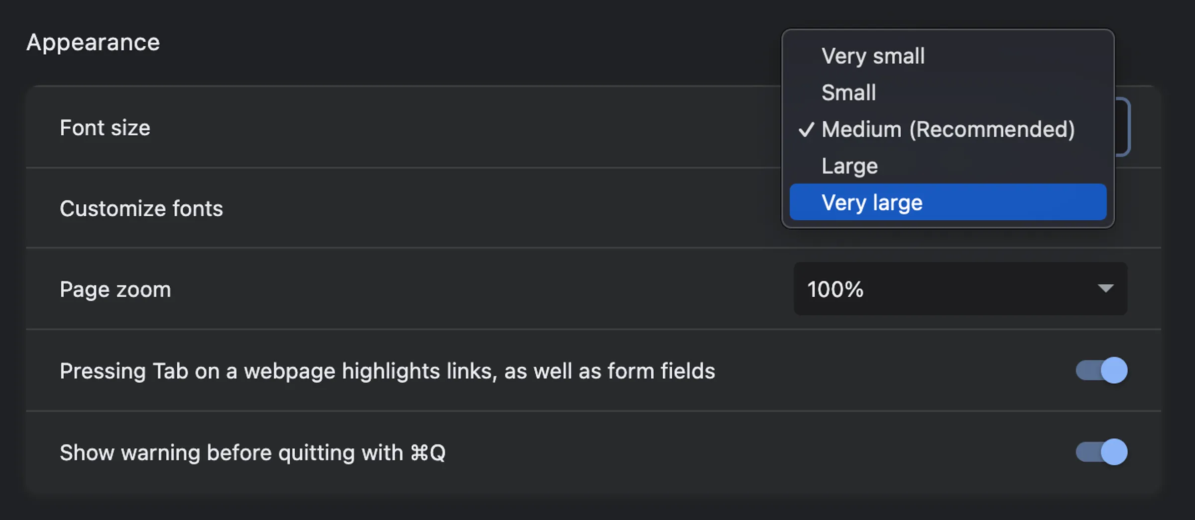
Here in the browser appearance settings in Chrome you can set the base font size independently of page zoom.
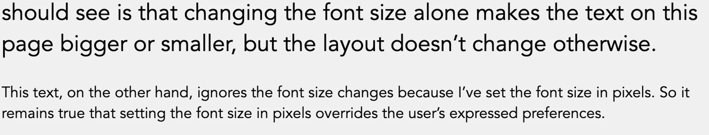
Chrome has their font size settings buried pretty deep in the settings. Safari binds text-only size increases to ⌘⌥ + / ⌘⌥ -. Firefox has a “zoom text only” toggle in the zoom menu. If you’re so inclined you can try those out now here on this page. What you should see is that changing the font size alone makes the text on this page bigger or smaller, but the layout doesn’t change otherwise.
This text, on the other hand, ignores the font size changes because I’ve set the font size in pixels. So it remains true that setting the font size in pixels overrides the user’s expressed preferences. The standard page zoom, on the other hand, won’t make this paragraph look any different from the others.
Update March 16, 2024: Nicolas Hoizey pointed out that Firefox zooms text even if the size is set in pixels. This is also the case in Safari. So to see the behavior I described above, you have to be using Chrome (or its derivatives). Interestingly, the only thing this effectively changes is that if Chrome adopts this strategy, too, even sizing fonts in rem or em will become an academic / purity exercise.
Here’s what it looks like on my computer if I set the font size setting to “very large” in Chrome.
The font sizes set in rem or em scale, but the paragraph set in px stays the same
regardless.
This behavior is possible here because I’ve set margins, padding, and responsive container sizes controlling layout to rely on pixel values, while keeping font size and line heights relative.
If, however, you follow the conventional wisdom (“px units are evil”), the end result is that changing the base font size alone works exactly the same way as page zoom already works.
You are re-implementing page zoom, which is pointless. But you are also removing the ability for users to change font size independently.
Where does this leave us? Well.
- Sizing everything using
pxsatisfies WCAG 2.1 1.4.4 through technique G142 as long as people use one of the very common browsers with “page zoom.” People who want to resize text independently are just out of luck. - Sizing everything using
remsatisfies the same requirement through technique C28 and technique G146, but since that’s already met by browser page zoom, resizing text independently is impossible. - Mixing
pxandremsdeliberately satisfies accessibility requirements through technique G179, as long as access to all of the content and functionality remains available. This approach does not interfere with the native browser support offered through page zoom. So it’s the only choice that supports both page and text-only zoom on Chrome.
The third option is the most difficult. If you go this route, you have decide what should scale with font size and what shouldn’t. That’s many new judgement calls and a lot more testing. Maybe you don’t want or can’t support that. But it does preserve your visitors’ ability to scale text independently of your layout.
It also demonstrates why following conventional wisdom banning specific practices without regard for context has unintended consequences and leads to pointless complexity.
That, at least, is my thinking for this project. Am I wrong? Perhaps I am wrong. Maybe conventional wisdom is conventional for good reason, and my attempt to support text-only preferences is the real waste of time and resources. I’d love to hear your opinions on the matter, so let me know on Mastodon.
[...]